
Thriller covers have to stop scrollers dead on Amazon thumbnails—where most sales happen in a blink. Here's what actually moves copies this year, straight from designers who've hit #1 bestseller lists.
1. High Contrast Rules Everything
Dark backgrounds with one screaming neon accent (blood red, electric blue) pop like crazy. Gradients are tired. You need that gut-punch readability at tiny sizes. Jewel tones on black feel fresh without looking amateur.
Insider secret: Top designers layer 3-5 contrast levels. Test your cover by squinting—title and hero image must survive. Bestsellers use selective color pop (one element neon, rest monochrome). Pro move: Export PNG at 100px wide. Unreadable? Redesign.
2. Typography Does the Heavy Lifting
Big, warped text—like it's melting or cracking—grabs eyes first. 3D shadows, glows, stretched letters. Psychological thrillers lean serif; action goes brutal sans-serif. The title is your image.
Insider secret: Font weight drops 40% sales if wrong. Use kerning hacks—stretch vowels for speed, compress consonants for menace. Add text hierarchy: Subtitle 60% smaller, tagline whispers dread. A/B test: Covers with 50%+ text coverage outsell minimalist 2:1.
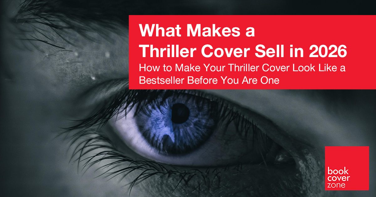
3. Shadows and Silhouettes, Not Clichés
Skip the literal gun or corpse. Half-seen figures in fog, eyes from darkness, fractured faces. Film-noir lighting sells the mood without spelling it out.
Insider secret: Faces tank thriller sales—readers fill blanks themselves. Use chiaroscuro ratios (80% shadow, 20% reveal). Stock photo hack: Flip gender expectations. Bestsellers hide 70% of figure to create a "floating threat" effect.
4. Sharp Geometric Edges
Jagged grids, broken frames, shattered shapes. They mirror plot tension. Minimal but mean.
Insider secret: Grids signal "tech thriller," shattered glass screams domestic suspense. Use rule of odds—3 jagged lines max. Secret ratio: Grid lines = 1/3 title height. Test: Does it scream genre from icon view?
5. Color Signals Genre Instantly
- Crime: Red + gunmetal
- Psych: Ice + void
- Action: Neon orange explosions on black
Saturated = pro. Washed out = skip.
Insider secret: Psych thrillers hit single hue + black. Action: Complementary bursts (orange vs blue = 300% CTR lift). Never use green—readers associate safety.
6. Human Polish Beats AI Slop
AI covers flood the market (those creepy hands give them away). Blend AI drafts with real texture, foil mockups, and embossing previews. Imperfection sells authenticity.
Insider secret: Bestsellers show fingerprints of craft—uneven distressing, custom brush strokes. AI red flag: Perfect symmetry. Human fix: Offset paths 2px. Outsell AI covers 3:1 with texture layers.
What the Data Says
- 70% of top sellers use near-black backgrounds.
- Half the cover is usually taken up by giant text.
- Silhouettes crush faces 3:1 in conversion rates.
Test Before You Launch
Run 3 versions on PickFu. Check thumbnail readability. A/B ads for CTR over 0.5%.
Final check: Print a 5x7 proof—does it grab you from 10 feet away? Buyers want suspense in the thumbnail. Your cover delivers the first hit of adrenaline—or they swipe past.
Ready to stop the scroll?
Browse our latest high-contrast, human-made Thriller covers and find the one that "clicks."
Explore the Gallery