
In Suspense, typography is the ticking clock. It is the visual equivalent of a footfall in a dark hallway—designed to make the reader hold their breath before they even scan the first line of the blurb.
When we design a Mystery or Thriller cover here at BookCoverZone, we are playing with psychological cues. This is a genre defined by the "hook"—that immediate, visceral need to know what happens next. In our studio, the typeface choice is an extension of that hook. Is it a heavy, aggressive font that suggests an unstoppable force? Or is it a thin, elegant serif that hints at a high-society scandal with a deadly cost? We treat the title as a piece of evidence, strategically placed to lure the reader into the investigation.
The Unstoppable Force: Bold and Heavy Sans Serifs
For "High-Stakes Thrillers" and "Techno-Thrillers"—the kind where a protagonist is racing against time—the gold standard is the Extra-Bold Sans Serif. We need fonts that feel loud, urgent, and masculine. Typefaces like Impact, Bebas Neue, and Franklin Gothic (Extra Condensed) are the workhorses of this genre.
When we use these at BookCoverZone, we aim for "maximum real estate." By using condensed versions of these fonts, we can make the letters massive without losing readability. We often set these titles in stark white or "Warning Yellow" against a pitch-black background. This high contrast triggers an instinctive "Danger" response in the human brain, signaling that the story inside is fast-paced, high-pressure, and impossible to put down.
The Chilling Whisper: Elegant and Sharp Serifs
Psychological Suspense and "Domestic Noir" often require a more subtle approach. Here, we move away from the "loud" fonts toward Sharp, High-Contrast Serifs. We want the title to feel like a cold blade. Typefaces like Cormorant Garamond, Cinzel, or Bodoni provide the perfect balance of sophistication and unease.
At BookCoverZone, our secret for psychological covers is in the "fragility." We use lighter weights to suggest that the protagonist's world is thin and easily broken. By adding a very slight "shear" or an offset shadow, we create a sense of "Uncanny Valley"—the font looks normal at first glance, but something is just slightly *off*. It tells the reader that the horror in this book isn't a monster, but the person living right next door.
Market Snapshot: The "Big Author" Look and Modern Minimalism
The Mystery/Thriller market is dominated by the "Big Author" aesthetic—think Lee Child, James Patterson, or Gillian Flynn. The latest trend is "Dominant Typography," where the author's name and the title take up almost the entire cover, leaving only a sliver of imagery (like a single red shoe or a dark silhouette) to suggest the plot.
At BookCoverZone, we've observed a shift toward "Hand-Defaced" typography in the Domestic Noir sub-genre. This involves taking a very clean, beautiful font and literally "crossing it out" or "blurring" it. This trend signals a narrative of deception—the idea that the "official" story is being edited or hidden by a narrator who might not be telling the truth. It is a powerful way to communicate "Reliability" issues visually.
The Noir Legacy: Modern Typewriter and Stencil Fonts
For "Detective Noir" or "Police Procedurals," we often lean into the heritage of the genre. Typewriter and Stencil fonts evoke the feeling of confidential files, crime scene reports, and late-night investigative sessions. Fonts like Special Elite or Toxico are frequently used for this purpose.
The trick at BookCoverZone is to avoid making these look like a cliché. We might use a typewriter font for the "subtitle" or the "author's blurb" while keeping the main title in a sharp, modern sans-serif. This contrast suggests a modern investigation looking into a past crime. By adding "ink smudge" textures or "photocopy noise," we make the title feel like it was pulled directly from a cold-case file.
Typeface Hacks For Mystery & Thriller Books
Thriller typography is about creating tension through visual distortion. Here are the secrets we use at BookCoverZone to make your title feel dangerous:
1. The "Slashed" Letter: Take a bold font and add a thin, diagonal "slice" through the middle of the words. This suggests a cut or a breach in security, adding an immediate sense of violence.
2. Motion Blur Trailing: We apply a horizontal motion blur to only one side of the letters. This makes the title look like it's being snatched away or is moving too fast to be caught, perfect for "The Girl Who..." style thrillers.
3. The "Inverted" Color Block: Place your title inside a solid colored rectangle (usually red or yellow) and "knock out" the letters so the background image shows through them. This makes the title look like a police barricade or a warning sign.
4. Perspective Distortion: We often tilt the title so it looks like it's receding into the distance or lying flat on the ground. This "cinematic" angle makes the title feel like a physical part of a crime scene.
5. The "Ticking" Tracking: Use very tight letter spacing for the first half of a title and very wide spacing for the second. This visual "stutter" creates an unconscious sense of anxiety in the reader, perfectly matching the pacing of a suspenseful plot.
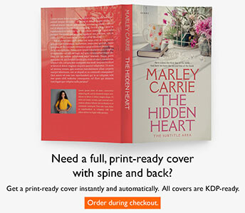
Every mystery is a puzzle, and your cover is the first clue. At BookCoverZone, we specialize in making that first impression a gripping one. Whether you are looking for a high-impact premade design that dominates the Amazon charts or a custom cover designed to visualize your specific twist, our designers are here to help you capture the mystery of your story.